This is a solution to the Social proof section challenge on Frontend Mentor.
- This is my solution to the social proof section challenge with some changes, I choose to change a little bit from what was asked and I really enjoyed the results and still need some improvements that I'll be working on.
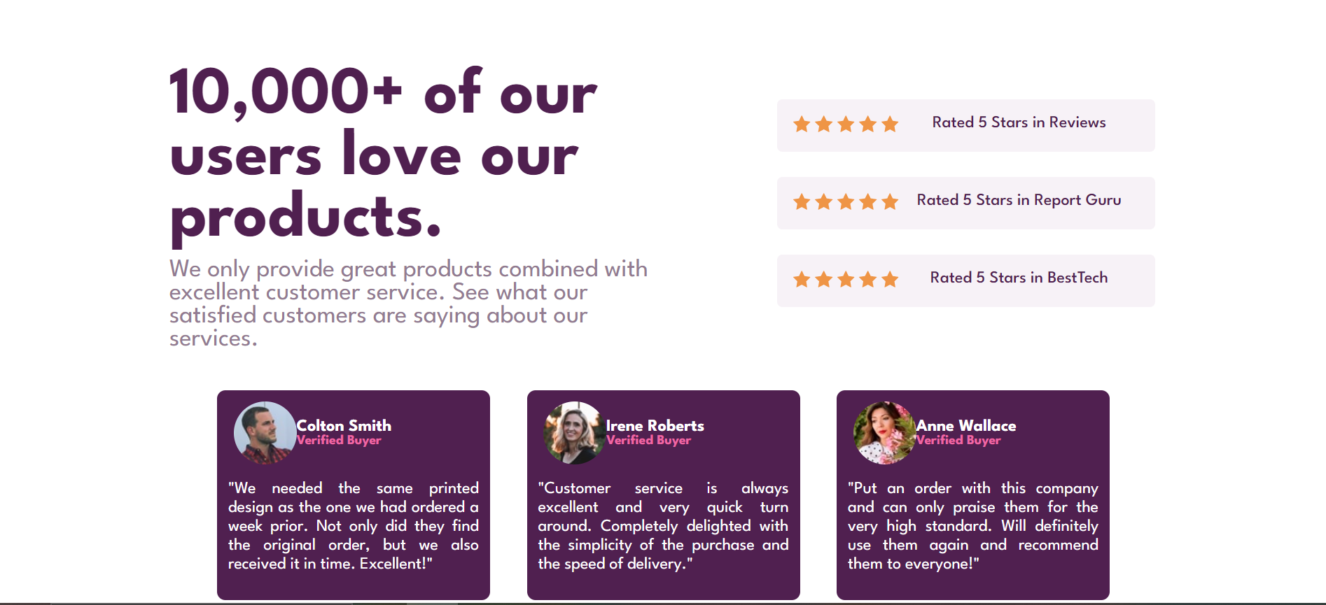
Users should be able to:
- View the optimal layout for the section depending on their device's screen size
- Live Site URL: https://andressablima.github.io/SocialProofSection/
I started with structuring HTML page and then making basic CSS improvements. I had some issues with flexbox, hours trying to put all together and puting all in the right places and sizes. The responsive part, where I had to go from small screeen to big screens was also challenging, try not to wrap all and change the sizes according to the screen sizes, but in the end I think it worked well. I found some issues when using firefox, but using Chrome was all good and I tried to figure it out but I need to work on it.
- Semantic HTML5 markup
- CSS custom properties
- Flexbox
- Mobile-first workflow
I learned to work better with responsive screens and flex, even though I still need to work on my flexbox and css skills. But my CSS skills were better know.
- LinkedIn - Andressa Lima
- Frontend Mentor - @andressablima
I'm gratefull to all Pedro Marins team that asked us to do a challenge and challenge ourselves and try to improve the code.