Warning
This documentation is for an upcoming version (v1.5)
This README reflects features currently under development. While the documentation is mostly usable, some parameters and options will only be available starting from version 1.5.
🚧 This version is not yet released on HACS.
👉 To view the documentation corresponding to the version currently available on HACS, please refer to the stable README here.
A modern Entity progress card for Home Assistant's Lovelace UI.
Jump to the specific section:
- ⚡ Description & features
- 📦 Installation
- 🧱 Entity Progress Components
- 📝 Usage
- 🎨 Theme
- 🌍 Language & Number Support
- 🚨 Errors, Deprecations & Troubleshooting
- 👥 Contributing
- 🙏 Credits & Acknowledgements
- 📄 License
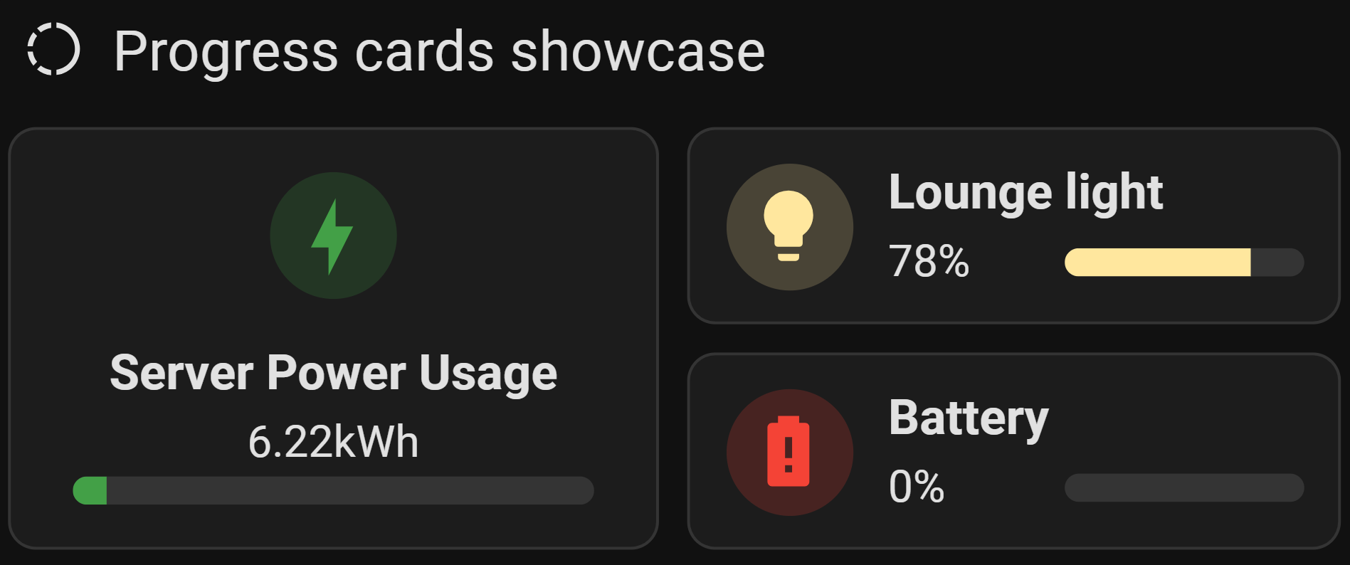
This custom version of the Bar Card for Home Assistant allows you to display a simple
percentage bar that is quick and easy to integrate into your Lovelace cards. It blends
seamlessly with the Tile/Mushroom look & feel of the latest Home Assistant versions.
This card is based on custom CSS and leverages existing code to fine-tune the appearance.
- Percentage Progress Bar: Displays the progress of a specified entity in percentage.
- Seamless Integration with Home Assistant's Modern UI: Fully aligns with the "Tile" look & feel of recent Home Assistant versions.
- Dynamic Theme: Automatically adjusts icons and colors based on the context (e.g., Battery Theme), reflecting the entity's state.
- Enhanced Customization: Offers a balanced default setup while allowing users to further tailor the card's behavior and appearance through YAML or the card editor (full details below).
- Smooth Animations: Provides HTML elements that facilitate smooth, visually appealing animations, leveraging well-known mechanisms for easy implementation.
- Interactive Features: Includes all "xyz_action" option, enabling users to view additional entity details or navigate to another dashboard with a simple click, improving accessibility and usability.
- Performance Optimized: Code enhancements ensure better performance and maintainability, offering a more stable and responsive experience.
- Multi-Language Support: Provides localized error messages and descriptions, supporting multiple languages 🇸🇦 🇧🇩 🇨🇿 🇩🇰 🇩🇪 🇬🇷 🇬🇧 🇪🇸 🇫🇮 🇫🇷 🇮🇳 🇭🇷 🇮🇩 🇮🇹 🇯🇵 🇰🇷 🇲🇰 🇳🇴 (bokmål) 🇳🇱 🇵🇱 🇵🇹 🇷🇴 🇸🇪 🇹🇭 🇹🇷 🇺🇦 🇻🇳 🇨🇳.
| Platform | Browsers | ||||
|---|---|---|---|---|---|
 |
 |
 |
 |
 |
 |
| Home Assistant | Chrome | Edge | Firefox | Safari | Opera |
2024.0+ |
98+ |
98+ |
94+ |
15.4+ |
84+ |
Important
Ensure your Home Assistant instance is up to date to support this custom card.
entity-progress-card is available in HACS (Home Assistant Community Store).
Use this link to directly go to the repository in HACS

Tip
If you are unable to use the button above, follow the steps below:
- Add this repository to HACS: Go to HACS ➡️ Integrations ➡️
⋮➡️ Custom repositories. - Paste the URL of this repository and select Dashboard as the category.
- Install the Entity Progress Card from HACS.
Manual Installation (click to expand)
- Download the file
entity-progress-card.js(from the last version) to the/config/www/directory in your Home Assistant setup. - Add
/local/entity-progress-card.jsto your Lovelace resources:- Go to Settings ➡️ Dashboards ➡️ Resources ➡️
⋮➡️ Add Resource - Set :
- URL:
/local/www/entity-progress-card.js - Type:
JavaScript Module
- URL:
- Save
- reload the browser cache (
CTRL+F5or clear cache).
- Go to Settings ➡️ Dashboards ➡️ Resources ➡️
This documentation is meant to help you understand and use the different Entity Progress components in Home Assistant (cards and badges, both standard and template versions), providing clear guidance.
| Component | Description |
|---|---|
| Entity Progress Card | A simple card displaying a progress bar for a single entity. |
| Entity Progress Card Template | A more advanced version with full Jinja templating support. |
| Entity Progress Badge | A compact badge with a mini progress bar. |
| Entity Progress Badge Template | A templatable badge version for advanced use cases. |
Each component is suited for different use cases, depending on display needs, complexity, and UI layout.
This card is ideal when:
- You want to display the progress of a single entity (e.g., battery level, completion percentage, charging status).
- You want easy visual representation with minimal configuration.
- You want to enable quick interactions via tap_action, hold_action, or double_tap_action.
Examples:
- Show a vacuum cleaner's cleaning progress.
- Display remaining battery percentage for a device.
- Monitor the progress of a running script or automation.
Essentially, if you need a clear, visually appealing progress bar that's easy to configure and fits well into the Home Assistant ecosystem, this is your go-to card.
Use the Template version (card or badge) when:
- You need to calculate the percentage manually from multiple sensor values (e.g., water tank level from height readings).
- Your use case involves conditional logic, math, or non-linear scales.
- You want to use Jinja2 templates directly in the YAML, without creating extra helpers or sensors.
- You need maximum flexibility without being restricted by the standard options.
Examples:
- Calculate energy usage progress from a total daily quota.
- Dynamically adjust color or shape based on a formula.
- Show remaining laundry time based on a template sensor.
| Use a Card when… | Use a Badge when… |
|---|---|
| You want rich layout and interactivity | Space is limited (e.g., header views) |
| You need to show actions, icons, and text | You just need quick-glance visuals |
| You rely on theme integration and animations | You want to embed progress in compact form |
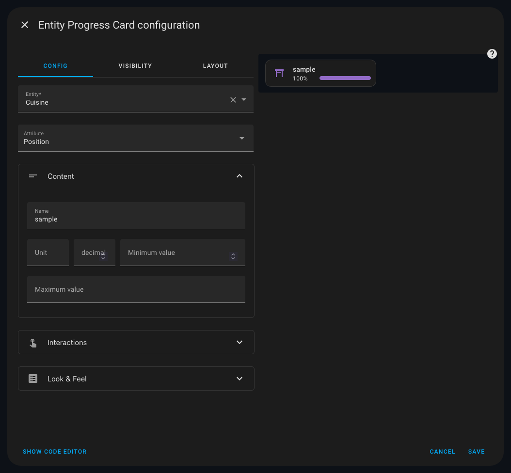
The card editor allows you to quickly set up and customize the card.
Show the screenshot (click to expand)
This is the primary card for displaying entity progress.
Options and Configuration (click to expand)
| Option | Type | Default | Description | Link |
|---|---|---|---|---|
| Data Options | ||||
entity |
string (required) | — | Main entity ID | Config Ref. |
attribute |
string (optional) | depends on entity | Attribute to use as value | Config Ref. |
name |
string (optional) | entity name | Custom name to show | Config Ref. |
unit |
string (optional) | auto |
Unit displayed | Config Ref. |
decimal |
integer (optional) | context-based | Number of decimal places | Config Ref. |
min_value |
float (optional) | 0 or -100 |
Min for progress calculation | Config Ref. |
max_value |
float/string (optional) | 100 |
Max for progress calculation | Config Ref. |
max_value_attribute |
string (optional) | — | Attribute from max_value entity |
Config Ref. |
reverse |
boolean (optional) | depends on entity | Countdown-style behavior | Config Ref. |
state_content |
string/list (optional) | depends on domain | Attribute to show near value | Config Ref. |
custom_info |
Jinja (optional) | — | Extra info near value | Config Ref. |
name_info |
Jinja (optional) | — | Extra info near name | Config Ref. |
additions |
list (optional) | — | Additional entities to display | Config Ref. |
| Styling Options | ||||
icon |
string (optional) | — | Icon override | Config Ref. |
color |
string (optional) | based on entity | Icon color | Config Ref. |
badge_icon |
Jinja (optional) | — | Dynamic badge icon | Config Ref. |
badge_color |
Jinja (optional) | — | Dynamic badge color | Config Ref. |
bar_color |
string (optional) | var(--state-icon-color) |
Color of progress bar | Config Ref. |
bar_size |
string (optional) | small |
Size of the progress bar | Config Ref. |
bar_position |
string (optional) | default |
Position of the progress bar | Config Ref. |
bar_single_line |
boolean (optional) | false |
single-line mode for overlay bars | Config Ref. |
bar_effect |
string/list/jinja | — | Visual effects for the bar | Config Ref. |
bar_orientation |
string (optional) | ltr |
Bar direction | Config Ref. |
force_circular_background |
boolean (optional) | false |
Force icon circle background | Config Ref. |
trend_indicator |
string (optional) | false |
Displays trend icons. | Config Ref. |
layout |
string (optional) | horizontal |
Layout direction | Config Ref. |
frameless |
boolean (optional) | false |
Remove card frame | Config Ref. |
marginless |
boolean (optional) | false |
Remove top/bottom margin | Config Ref. |
height |
string (optional) | — | Card height | Config Ref. |
min_width |
string (optional) | — | Minimum width | Config Ref. |
reverse_secondary_info_row |
boolean (optional) | false |
Flip info bar layout | Config Ref. |
unit_spacing |
string (optional) | auto |
Controls space between value and unit | Config Ref. |
center_zero |
boolean (optional) | false |
Center the bar on 0 | Config Ref. |
theme |
string (optional) | — | Applies a preset theme | Config Ref. |
custom_theme |
list (optional) | — | Define color thresholds | Config Ref. |
hide |
list (optional) | — | Hide parts of the card | Config Ref. |
disable_unit |
boolean (optional) | false |
Hide the unit text | Config Ref. |
watermark |
map (optional) | — | Adds min/max overlays | Config Ref. |
| Behavior And Actions | ||||
xyz_action |
map (optional) | see defaults | Tap/double/hold actions | Config Ref. |
Percentage Calculation (click to expand)
This card automatically calculates progress percentages based on the current entity, depending on the type of input it receives: - Timer: If the value represents a timer, the range (min, max) and the current value are taken directly from the timer entity. Attribute will not be used.-
Counter or Number value: If the value is a counter or a Number ({ value, min, max }), it uses the provided value directly from the entity. The max value can also come from another entity by using max_value. Attribute will not be used.
-
Other entity: If the entity value is a number, it’s treated as the current value. The min and max boundaries are taken from default value (0/100) or configuration or external entities depending on the setup. If max_value is an entity, its current value is used.
Here are some examples of how to use the Standard Lovelace Entity Progress Card.
Tip
Use Material Design Icons (MDI) for a consistent look. Browse available icons at Material Design Icons. Experiment with color codes like HEX or RGB for precise customization. Combine with other Lovelace cards to create a visually cohesive dashboard.
In addition to styling tips, it’s important to understand how this card interacts with other powerful Lovelace tools.
Important
Below, you'll find examples that highlight the interoperability of this card with other popular Home Assistant projects. To replicate these samples, ensure the following are set up:
📌 vertical-stack-in-card (GitHub link) 📌 auto-entities (GitHub link) 📌 card_mod (GitHub link)
Basic Usage (YAML Example)
Here’s our example of how to use the Custom Bar Card with custom styles:
type: custom:entity-progress-card
entity: sensor.hp_envy_6400_series_tri_color_cartridge
name: RVB
icon: mdi:grain
color: rgb(110, 65, 171)
bar_color: rgb(110, 65, 171)
icon_tap_action:
  action: more-info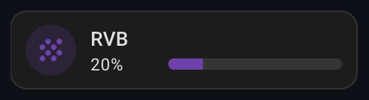
Grid Option and Vertical Layout Example (click to expand)
Another example with grid_option and vertical layout:
type: custom:entity-progress-card
entity: sensor.hp_envy_6400_series_tri_color_cartridge
name: RVB
icon: mdi:grain
color: yellow
bar_color: green
icon_tap_action:
  action: more-info
layout: vertical
grid_options:
  columns: 3
  rows: 2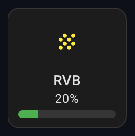
Battery dashboard Example (click to expand)
This card enables the creation of a streamlined battery dashboard by leveraging
theme capabilities and auto-entities custom card.
type: custom:auto-entities
filter:
  include:
    - attributes:
        device_class: battery
      options:
        type: custom:entity-progress-card
        entity: this.entity_id # remove this line with auto-entities v1.14.1+
        theme: optimal_when_high
        icon_tap_action:
          action: more-info
card:
  square: false
  type: grid
  columns: 2
show_empty: true
card_param: cards
sort:
  method: state
  numeric: true
  ignore_case: false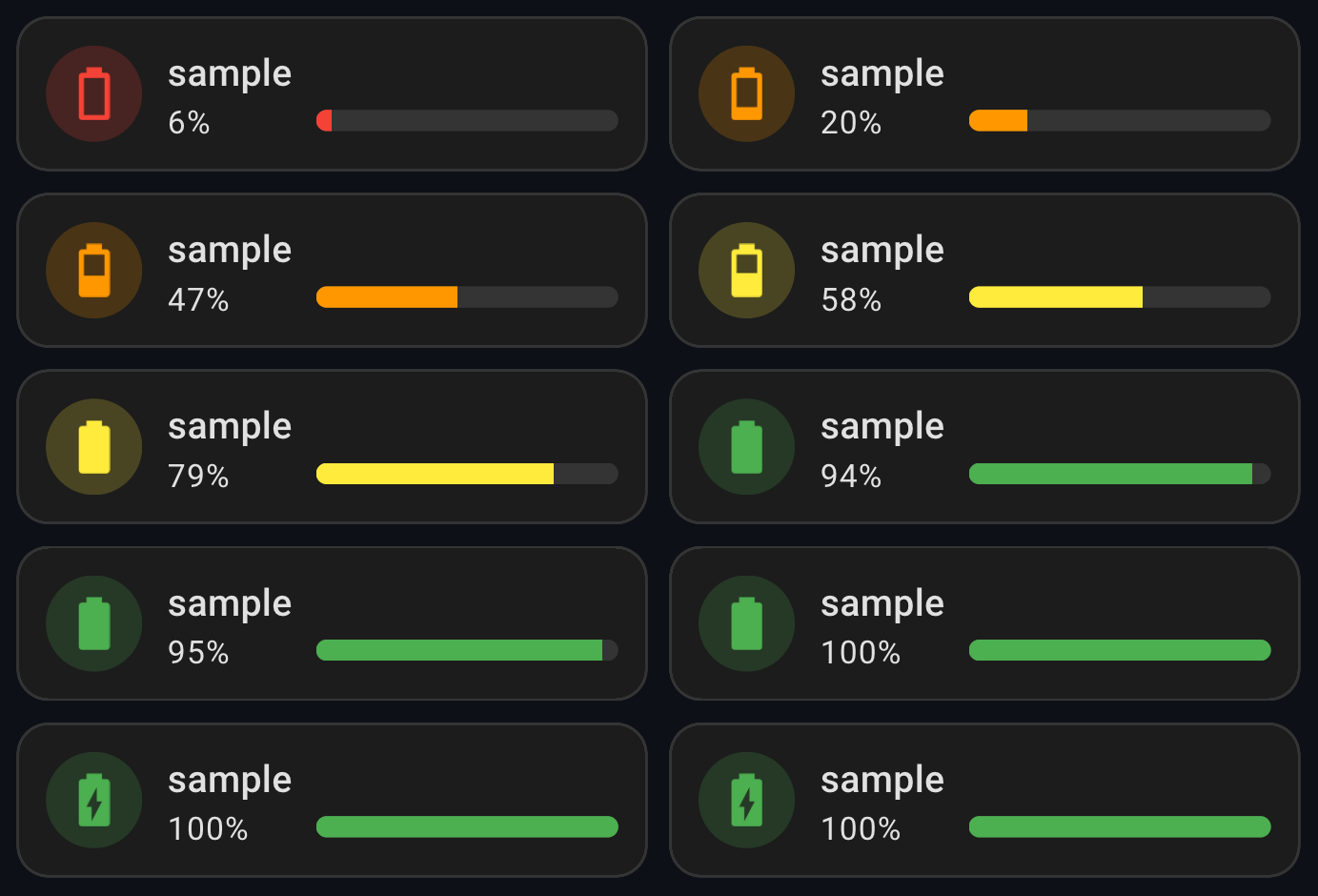
Litter box Example (click to expand)
Do you want a percentage based on a minimum and maximum quantity? Here’s an example with a litter box:
type: custom:entity-progress-card
entity: sensor.petkit_puramax_2_poids_litiere
min_value: 6
max_value: 12
name: Litter
theme: optimal_when_high
grid_options:
  columns: 6
  rows: 1
card_mod / animation Example (click to expand)
We can use card_mod to add dynamic animations to the icon, enhancing the visual
experience and providing a more engaging user interface.
Example:
type: custom:entity-progress-card
entity: sensor.hp_envy_6400_series_tri_color_cartridge
name: RVB
icon: mdi:grain
color: rgb(110, 65, 171)
bar_color: rgb(110, 65, 171)
card_mod:
  style: |-
    .icon {
      animation: boing 3s ease infinite;
      transform-origin: 50% 90%;
    }
    @keyframes boing {
      0% { transform: scale3d(1, 1, 1); }
      7% { transform: scale3d(1.25, 0.75, 1); }
      10% { transform: scale3d(0.75, 1.25, 1); }
      12% { transform: scale3d(1.15, 0.85, 1); }
      16% { transform: scale3d(0.95, 1.05, 1); }
      19% { transform: scale3d(1.05, 0.95, 1); }
      25% { transform: scale3d(1, 1, 1); }
    }
Tip
We expose the .icon and .shape to properly animate the card.
vertical-stack-in-card Example (click to expand)
We can use vertical-stack-in-card to group multiple cards into a cohesive
layout. This approach is particularly useful when combining custom cards while
maintaining a consistent design. Additionally, we leverage auto-entities to
dynamically list entities based on specific attributes or filters, allowing for
flexible and automatic card generation. Finally, card_mod is used to remove
the borders and shadows, ensuring a clean and seamless appearance.
Example:
type: custom:vertical-stack-in-card
cards:
  - type: custom:auto-entities
    filter:
      include:
        - attributes:
            device_class: battery
          options:
            type: custom:entity-progress-card
            entity: this.entity_id # remove this line with auto-entities v1.14.1+
            name: sample
            theme: optimal_when_high
            icon_tap_action:
              action: more-info
            card_mod:
              style:
                .: |-
                  :host {
                    --ha-card-border-width: 0px !important; /* Forcer la suppression des bordures */
                    box-shadow: none !important; /* Supprimer l'ombre pour enlever tout contour */
                  }
    sort:
      method: friendly_name
    card:
      square: false
      type: grid
      columns: 2
    card_param: cards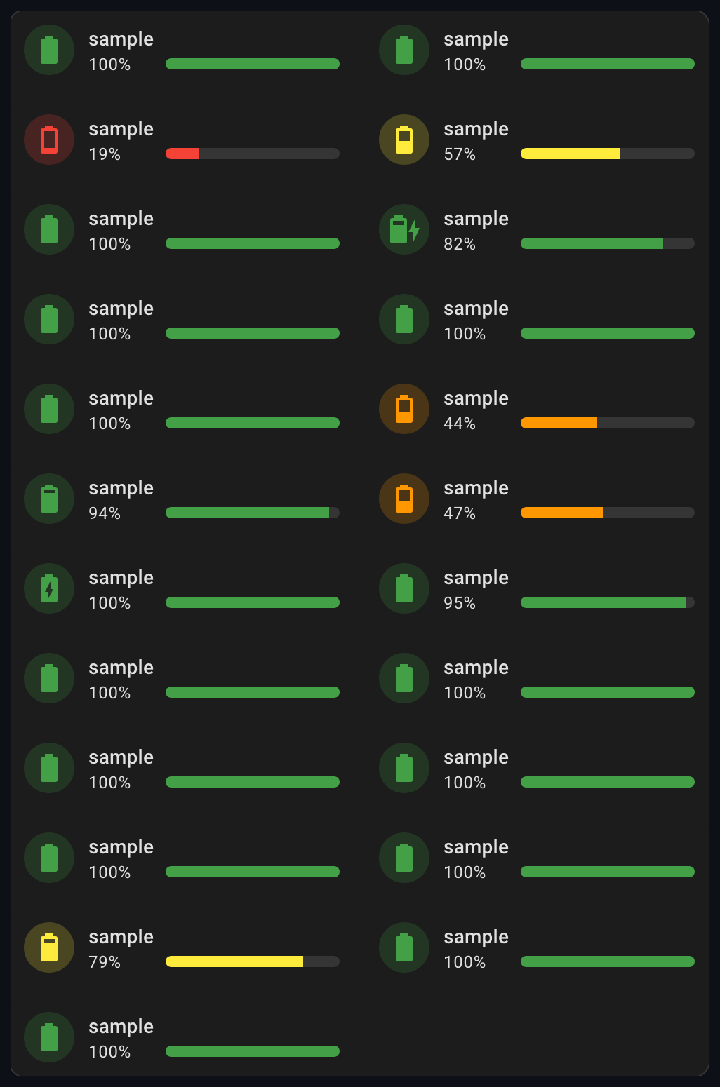
vertical-stack Example (click to expand)
We can use native vertical-stack to group multiple cards into a cohesive
layout.
type: vertical-stack
cards:
  - type: custom:entity-progress-card
    name: Sofa
    icon: mdi:sofa
    entity: sensor.xyz
grid_options:
  columns: 6
  rows: auto
visibility:
  - condition: numeric_state
    entity: input_number.xyz
above: 0The Laundry Mystery: Decoding Washer Entities Across Brands (click to expand)
Why?
Each washing machine brand has its own way of providing entities in Home Assistant. As a result, you often end up with multiple entities that have different names depending on the integration used. This can make managing these entities tricky, especially if you want a simple and clear card to track the standard elements of your washing machine.
The goal here is to simplify the display of important information related to your washing machine, regardless of the brand, by centralizing key data such as operational status, progress percentage, and remaining time, while maintaining flexibility to adapt to entity variations based on the integration used.
Searching for Entities
Before configuring your card, it's essential to research the specific entities for your washing machine integration. To do this, you will need to explore Home Assistant's developer tools to pinpoint the necessary information. Let’s take this personal integration as an example:
sensor.washing_machine_operation_state: This entity is very specific to my washing machine brand and the Home Connect integration that comes with it. It tracks the machine's operation state (running, paused, etc.).sensor.washing_machine_progress_current_percentage: This is a custom sensor defined inconfiguration.yaml. The integration only reports a percentage when the machine is running. The template sets it to 0% when the integration reports 'unavailable'.sensor.washing_machine_remaining_program_time: This entity shows the estimated time left until the program finishes. However, the entity's name doesn't exactly match what the integration provides.
These entities are crucial for getting a complete overview of the washing machine’s status, but they vary significantly depending on the brand and integration.
Setting Up the Card
Once the entities are identified, you can configure your card in YAML to display the necessary information.
Below an example that is currently used:
type: custom:entity-progress-card
entity: sensor.washing_machine_progress_current_percentage
name: Washing Machine
color: primary
tap_action:
  action: more-info
icon_tap_action:
  action: more-info
bar_color: primary
bar_size: large
badge_icon: >-
  {% if states('sensor.washing_machine_operation_state') == 'run'
  %}mdi:power-on{% else %}mdi:power-off {% endif %}
badge_color: >-
  {% if states('sensor.washing_machine_operation_state') == 'run' %} blue {%
  else %} disabled {% endif %}
name_info: >-
  {% if has_value('sensor.washing_machine_remaining_program_time') %} ready at
  {{ as_timestamp( states('sensor.washing_machine_remaining_program_time') ) |
  timestamp_custom('%H:%M', true) }}{% endif %}
In this example, the card displays:
- The progress percentage
- The operational status
- The remaining time
Conclusion
Using Jinja and custom entity configurations in Home Assistant provides advanced flexibility for adapting the card to the specifics of each washing machine. With this approach, you can create a single card that works with different integrations while displaying relevant information in a clear and consistent manner.
Cracking a Complex Case with a Simple Helper (click to expand)
Why ?
We want to monitor a process and we have entities for:
- start time: states.sensor.print_puppy_start_time (time)
- finish time: states.sensor.print_puppy_end_time (time)
- and remaining time: sensor.print_puppy_remaining_time (min)
Our goal is to display the percentage of remaining time and show the remaining time in minutes. Unfortunately, the standard usage of this card cannot achieve what we need. We read the README it seems to be impossible but...
Mathematical Model
Using a simple model, we can calculate the percentage of remaining time with:
Where:
-
$P_{\text{remain}}$ : Percentage of remaining time (the expected result). -
$t_{\text{remain}}$ : Remaining time (in minutes). -
$\Delta T$ : Total duration of the task (in minutes).
The good news is that we can use an entity to define the max_value and dynamically
calculate the percentage. Therefore, we need to find a way to determine
How ?
We'll use a Helper (Number) to handle this calculation. It’s simple to define and can be set up according to various needs.
-
Go to
settings>Devices and services>Helpers>Create Helper>Template>Template a number -
Define the template to do the delta automatically
-
Choose a name and define your state template:
{% set start_time = states.sensor.print_puppy_start_time.state %}
{% set end_time = states.sensor.print_puppy_end_time.state %}
{% if start_time and end_time %}
  {{ ((as_datetime(end_time) - as_datetime(start_time)).days * 1440) + ((as_datetime(end_time) - as_datetime(start_time)).seconds / 60) | int }}
{% else %}
  unknown
{% endif %}
Check your syntax. Here, we are using entity values; therefore, we access the value through xyz.state. Sometimes, the value will be an attribute.
-
Set the minimum, maximum, step value, and unit accordingly.
-
Check the current value to ensure it’s working properly.
-
-
Define the card:
type: custom:entity-progress-card
entity: sensor.print_puppy_remaining_time
max_value: number.totaldurationofthetask
decimal: 0
bar_color: green
icon: mdi:clock-end
Conclusion
By implementing this model through the helper, we can accurately calculate and display the percentage of remaining time for any task. This approach provides a dynamic and intuitive way to monitor progress, ensuring that the displayed percentage accurately reflects the time remaining regardless of the task’s total duration. This solution effectively extend our card usage vision, and enhances the user experience.
Don't Let It Expire ! (click to expand)
This example is similar to the previous one that used a Home Assistant helper but relying more on system-level tools—offering potentially greater efficiency at the cost of increased system dependency. We provide this example for illustration purposes only. Make sure to verify that no integration already exists before attempting this type of deployment. In the epilogue, I’ll suggest a more universal way to achieve the same result.
Why?
SSL certificates are critical for securing HTTPS connections. If one expires, it can make your services inaccessible — including your Home Assistant interface when accessed remotely.
The challenge? Certificates (especially Let's Encrypt) usually last only 90 days, and it's easy to forget when they expire.
👉 The goal here is to automatically track how many days are left (countdown) before your SSL certificate expires and visually display this countdown as a color-coded progress bar in the Lovelace dashboard.
How?
Here, we're using a Home Assistant instance running in Docker with access to Linux commands.
We will:
- Create a custom command_line sensor that calculates the number of days until the certificate expires.
- Setup the card with the new sensor.
- Add dynamic color coding to indicate urgency (red when close to expiry, green when safe).
Implementation
-
Create the command_line sensor, add this to your configuration.yaml (or sensors.yaml if split):
sensor:
  - platform: command_line
    name: 'SSL Certificate Expiry'
    command: >
      echo $(( ($(date -u -d "$(curl -vI --insecure https://<hostname>:<port> 2>&1 | grep -i 'expire date' | awk -F': ' '{print $2}' | sed -E 's/Jan/01/; s/Feb/02/; s/Mar/03/; s/Apr/04/; s/May/05/; s/Jun/06/; s/Jul/07/; s/Aug/08/; s/Sep/09/; s/Oct/10/; s/Nov/11/; s/Dec/12/' | awk '{print $4"-"$1"-"$2" "$3}')" +%s) - $(date +%s) ) / 86400 ))
    unit_of_measurement: 'days'
    scan_interval: 3600
You'll need to adjust this part to match your specific environment.
-
Add this card to your Lovelace dashboard:
type: custom:entity-progress-card
entity: sensor.ssl_certificate_expiry
name: SSL Certificate Expiry
icon: mdi:certificate
decimal: 0
min_value: 0
max_value: 90
bar_orientation: rtl
custom_theme:
  - min: 0
    max: 10
    color: red
  - min: 10
    max: 20
    color: yellow-color
  - min: 20
    max: 90
    color: green
grid_options:
  columns: 12
  rows: 1
Conclusion
With this setup, Home Assistant becomes a proactive security monitor for your SSL certificates. You get a clear visual on how much time is left — and can renew in time to avoid downtime.
This method is reusable for any use case that can be monitored at the system level.
Epilogue
It was fun to develop and can certainly be used as-is, but in practice, it relies on Linux system commands, which makes it less portable than the previous examples.
Ultimately, to meet the original goal, we can simply enable the cert_expiry
integration, which provides the certificate's expiration timestamp in a more
standardized and platform-independent way. Home Assistant helpers are powerful
tools, and whenever possible, they should be preferred to simplify
implementation.
With cert_expiry entity we can define a template helper (number) to generate a
countdown with :
-
create the template helper
-
define a name (number.cert_expiry_entity_id)
-
define state template
{% set target = states('sensor.<cert_expiry_entity_id>') %}
{% if target not in ['unknown', 'unavailable'] %}
  {% set target_ts = as_timestamp(target) %}
  {% set now_ts = as_timestamp(now()) %}
  {% set diff = (target_ts - now_ts) / 86400 %}
  {{ diff | round(1) if diff > 0 else 0 }}
{% else %}
  unknown # 0 to avoid error in HA log
{% endif %}
-
define min/max value: 0 and 90
-
step: 1
-
unit_of_measurement: days
Create the card:
type: custom:entity-progress-card
entity: number.cert_expiry_entity_id
name: SSL Certificate Expiry
icon: mdi:certificate
decimal: 0
bar_orientation: rtl
custom_theme:
  - min: 0
    max: 10
    color: red
  - min: 10
    max: 20
    color: yellow
  - min: 20
    max: 90
    color: green
unit: '%'
state_content: state
grid_options:
  columns: 12
  rows: 1
Now you have a working solution that avoids operating system dependencies and is more efficient within Home Assistant's ecosystem. Obviously, in the case of a Let's Encrypt certificate, it's recommended to :
- have a renewal process in place
- add a trigger to generate an alert before the certificate expires
This topics are beyond the scope of this guide.
This card is designed to handle more advanced use cases that aren't fully supported by the base card. It avoids the need for custom helpers by allowing you to implement your desired mathematical modeling directly through templating.
Available Jinja Options (click to expand)
| Options | Type | Description | Doc |
|---|---|---|---|
name |
JINJA | Renders the customized entity name | Config Ref. |
icon |
JINJA | Main icon shown on the card | Config Ref. |
secondary |
JINJA | Renders the secondary content (e.g., unit, status, additional info) | Config Ref. |
percent |
JINJA | Numerical value representing progress (0–100%), affects progress bar width | Config Ref. |
color |
JINJA | Dynamic color for the icon and shape, adapted using ThemeManager |
Config Ref. |
bar_color |
JINJA | Dynamic progress bar color, also handled through ThemeManager |
Config Ref. |
Note
The keyword entity can be used in Jinja to represent the entity defined at the card level.
Supported Options (click to expand)
The following options remain fully compatible with this new card:
| Option | Type | Description | Link |
|---|---|---|---|
| Data Options | |||
entity |
string (optional) | Entity ID. | Config Ref. |
| Styling Options | |||
badge_icon |
Jinja (optional) | Dynamic badge icon | Config Ref. |
badge_color |
Jinja (optional) | Dynamic badge color | Config Ref. |
bar_size |
string (optional) | Customize the size or thickness of the progress bar. | Config Ref. |
bar_position |
string (optional) | Position of the progress bar | Config Ref. |
bar_single_line |
boolean (optional) | single-line mode for overlay bars | Config Ref. |
bar_effect |
string/list/jinja | Visual effects for the bar | Config Ref. |
bar_orientation |
string (optional) | Define the direction of the progress bar (e.g., ltr, rtl). |
Config Ref. |
force_circular_background |
boolean (optional) | Force icon circle background. | Config Ref. |
trend_indicator |
string (optional) | Displays trend icons. | Config Ref. |
layout |
string (optional) | Adjust the overall layout (e.g., horizontal, vertical). |
Config Ref. |
frameless |
boolean (optional) | Remove the default card border and background for a seamless, flat appearance. | Config Ref. |
marginless |
boolean (optional) | Remove vertical margin for a more compact template display. | Config Ref. |
height |
string (optional) | Card height | Config Ref. |
min_width |
string (optional) | Set a minimum width for the template to ensure consistent layout. | Config Ref. |
reverse_secondary_info_row |
boolean (optional) | Flip info bar layout. | Config Ref. |
center_zero |
boolean (optional) | Center the bar on 0. | Config Ref. |
hide |
list (optional) | Hide parts of the card. | Config Ref. |
watermark |
map (optional) | Adds min/max overlays. | Config Ref. |
| Behavior & Actions | |||
xyz_action |
map (optional) | Configure custom actions (e.g., tap, hold, etc.). |
Config Ref. |
Simple example (click to expand)
type: custom:entity-progress-card-template
entity: light.led0
icon: |-
  {% if states('automation.secuswitch') == 'on' %}
    mdi:ab-testing
  {% else %}
    mdi:abacus
  {% endif %}
name: "{{ state_attr('light.led0', 'friendly_name') }}"
secondary: "{{ states('light.led0') }}"
badge_icon: |-
  {% if states('light.led0') == 'on' %}
    mdi:ab-testing
  {% else %}
    mdi:library
  {% endif %}
badge_color: |-
  {% if states('light.led0') == 'on' %}
    green
  {% else %}
    grey
  {% endif %}
percent: |-
  {% if states('light.led0') == 'on' %}
    {{ (state_attr('light.led0', 'brightness') | float * 100 / 255) | round(2) }}
  {% else %}
    0
  {% endif %}
color: |-
  {% if states('light.led0') == 'on' %}
    orange
  {% else %}
    grey
  {% endif %}
bar_color: |-
  {% if states('automation.secuswitch') == 'on' %}
    yellow
  {% else %}
    red
  {% endif %}
watermark:
  low: 10
tap_action:
  action: navigate
navigation_path: /configFollow the sun (click to expand)
🧐 Why?
You want a visual representation of the sun's next event (sunrise or sunset) and the progress until it happens, directly in your Home Assistant dashboard. Instead of showing static time values, you aim to give users contextual, visual feedback on when the next sun transition will occur, and how far along we are toward it.
⚙️ How?
This card uses custom:entity-progress-card-template and dynamic Jinja2 templates to show:
- 📛 name
Dynamically shows:
- Next Rise: HH:MM if sunrise is next,
- Next Setting: HH:MM if sunset is next,
- or a fallback if sun data isn't available.
- 🎨 bar_color & color
- Bar turns orange when the sun is above the horizon.
- Turns light gray / invisible when it's below the horizon.
- 📄 secondary Displays a live countdown (e.g., in 02:34:12) until the next sun event, accounting for whether sunrise or sunset is next.
- 📊 percent
Calculates progress between the last and the next sun event.
- For example, at 50%: you're halfway between yesterday's and today's sunrise.
- Or halfway between yesterday's and today's sunset, depending on current time.
- 🖱️ tap_action Opens the standard more-info view for the sun.sun entity when tapped.
type: custom:entity-progress-card-template
name: >
  {% set sunrise = as_datetime(states('sensor.sun_next_rising')) %} {% set
  sunset = as_datetime(states('sensor.sun_next_setting')) %} {% set now_time =
  now() %} {% if sunrise and sunset %}
    {% if sunrise < sunset %}
      Next Rise: {{ sunrise.timestamp() | timestamp_custom('%H:%M', true) }}
    {% else %}
      Next Setting: {{ sunset.timestamp() | timestamp_custom('%H:%M', true) }}
    {% endif %}
  {% else %}
    Suninformation not available
  {% endif %}
entity: sun.sun
bar_color: |
  {% if states('sun.sun') == 'below_horizon' %}
    lightgray
  {% else %}
    orange
  {% endif %}
color: |
  {% if states('sun.sun') == 'below_horizon' %}
    none
  {% else %}
    orange
  {% endif %}
secondary: >
  {% set sunrise = as_datetime(states('sensor.sun_next_rising')) %} {% set
  sunset = as_datetime(states('sensor.sun_next_setting')) %} {% set now_time =
  now() %} {% if sunrise and sunset %}
    {% if sunrise < sunset %}
      {% set next_event = sunrise %}
      {% set last_event = sunrise - timedelta(days=1) %}
    {% else %}
      {% set next_event = sunset %}
      {% set last_event = sunset - timedelta(days=1) %}
    {% endif %}
    {% set delta = next_event - now_time %}
    {% set total_seconds = delta.total_seconds() %}
    {% if total_seconds > 1 %}
      {% set days = (total_seconds // 86400) | int %}
      {% set hours = (total_seconds % 86400) // 3600 %}
      {% set minutes = (total_seconds % 3600) // 60 %}
      {% set seconds = (total_seconds % 60) %}
      in
      {% if days > 0 %}
        {{ days }}d
      {% endif %}
      {{ '%02d:%02d:%02d' | format(hours | int, minutes | int, seconds | int) }}
    {% else %}
      now
    {% endif %}
  {% else %}
    --:--:--
  {% endif %}
percent: >
  {% set sunrise = as_datetime(states('sensor.sun_next_rising')) %} {% set
  sunset = as_datetime(states('sensor.sun_next_setting')) %} {% set now_time =
  now() %} {% if sunrise and sunset %}
    {% if sunrise < sunset %}
      {% set next_event = sunrise %}
      {% set last_event = sunrise - timedelta(days=1) %}
    {% else %}
      {% set next_event = sunset %}
      {% set last_event = sunset - timedelta(days=1) %}
    {% endif %}
    {% set total = (next_event - last_event).total_seconds() %}
    {% set elapsed = (now_time - last_event).total_seconds() %}
    {% if total > 0 %}
      {{ ((elapsed / total) * 100) | round(2) }}
    {% else %}
      0
    {% endif %}
  {% else %}
    0
  {% endif %}
tap_action:
  action: more-info
grid_options:
  columns: 12
  rows: 1
✅ Conclusion
This card provides a beautiful and intuitive sun progress indicator, using both visual (progress bar + color) and textual (countdown + time) information. It adapts based on current time and sun data, making it a smart and engaging way to track solar cycles from your dashboard.
This badge is designed to display the progress of an entity in a compact and customizable badge format with a dynamic progress bar.
Supported Options and Configuration (click to expand)
| Option | Type | Default | Description | Link |
|---|---|---|---|---|
| Data Options | ||||
entity |
string (required) | — | Main entity ID | Config Ref. |
attribute |
string (optional) | depends on entity | Attribute to use as value | Config Ref. |
name |
string (optional) | entity name | Custom name to show | Config Ref. |
unit |
string (optional) | auto |
Unit displayed | Config Ref. |
decimal |
integer (optional) | context-based | Number of decimal places | Config Ref. |
min_value |
float (optional) | 0 or -100 |
Min for progress calculation | Config Ref. |
max_value |
float/string (optional) | 100 |
Max for progress calculation | Config Ref. |
max_value_attribute |
string (optional) | — | Attribute from max_value entity |
Config Ref. |
reverse |
boolean (optional) | depends on entity | Countdown-style behavior | Config Ref. |
state_content |
string/list (optional) | depends on domain | Attribute to show near value | Config Ref. |
custom_info |
Jinja (optional) | — | Extra info near value | Config Ref. |
name_info |
Jinja (optional) | — | Extra info near name | Config Ref. |
additions |
list (optional) | — | Additional entities to display | Config Ref. |
| Styling Options | ||||
icon |
string (optional) | — | Icon override | Config Ref. |
color |
string (optional) | based on entity | Icon color | Config Ref. |
bar_color |
string (optional) | var(--state-icon-color) |
Color of progress bar | Config Ref. |
bar_size |
string (optional) | small |
Size of the progress bar | Config Ref. |
bar_effect |
string/list/jinja | — | Visual effects for the bar | Config Ref. |
bar_orientation |
string (optional) | ltr |
Bar direction | Config Ref. |
frameless |
boolean (optional) | false |
Remove card frame | Config Ref. |
marginless |
boolean (optional) | false |
Remove top/bottom margin | Config Ref. |
min_width |
string (optional) | — | Minimum width | Config Ref. |
reverse_secondary_info_row |
boolean (optional) | false |
Flip info bar layout | Config Ref. |
unit_spacing |
string (optional) | auto |
Controls space between value and unit | Config Ref. |
center_zero |
boolean (optional) | false |
Center the bar on 0 | Config Ref. |
theme |
string (optional) | — | Applies a preset theme | Config Ref. |
custom_theme |
list (optional) | — | Define color thresholds | Config Ref. |
hide |
list (optional) | — | Hide parts of the card | Config Ref. |
disable_unit |
boolean (optional) | false |
Hide the unit text | Config Ref. |
watermark |
map (optional) | — | Adds min/max overlays | Config Ref. |
| Behavior And Actions | ||||
xyz_action |
map (optional) | see defaults | Tap/double/hold actions | Config Ref. |
See Full Configuration Reference.
We use the same syntax as the card.
Simple example (click to expand)
type: custom:entity-progress-badge
entity: sensor.xyz
name: Kitchen
decimal: 1
icon: mdi:air-conditionerThis badge is designed to display the progress of an entity in a compact, customizable format with a dynamic progress bar. The entire template is now written in Jinja, offering significantly more flexibility and dynamic behavior.
Available Jinja Options (click to expand)
| Options | Type | Description | Doc |
|---|---|---|---|
name |
JINJA | Renders the customized entity name | Config Ref. |
icon |
JINJA | Main icon shown on the card | Config Ref. |
secondary |
JINJA | Renders the secondary content (e.g., unit, status, additional info) | Config Ref. |
percent |
JINJA | Numerical value representing progress (0–100%), affects progress bar width | Config Ref. |
color |
JINJA | Dynamic color for the icon and shape, adapted using ThemeManager |
Config Ref. |
bar_color |
JINJA | Dynamic progress bar color, also handled through ThemeManager |
Config Ref. |
Note
The keyword entity can be used in Jinja to represent the entity defined at the card level.
Supported Options (click to expand)
The following options remain fully compatible with this new card:
| Option | Type | Description | Link |
|---|---|---|---|
| Data Options | |||
entity |
string (optional) | Entity ID. | Config Ref. |
| Styling Options | |||
bar_size |
string (optional) | Customize the size or thickness of the progress bar. | Config Ref. |
bar_effect |
string/list/jinja | Visual effects for the bar | Config Ref. |
bar_orientation |
string (optional) | Define the direction of the progress bar (e.g., ltr, rtl). |
Config Ref. |
frameless |
boolean (optional) | Remove the default card border and background for a seamless, flat appearance. | Config Ref. |
marginless |
boolean (optional) | Remove vertical margin for a more compact template display. | Config Ref. |
min_width |
string (optional) | Set a minimum width for the template to ensure consistent layout. | Config Ref. |
reverse_secondary_info_row |
boolean (optional) | Flip info bar layout. | Config Ref. |
center_zero |
boolean (optional) | Center the bar on 0. | Config Ref. |
hide |
list (optional) | Hide parts of the card. | Config Ref. |
watermark |
map (optional) | Adds min/max overlays. | Config Ref. |
| Behavior & Actions | |||
xyz_action |
map (optional) | Configure custom actions (e.g., tap, hold, etc.). |
Config Ref. |
Simple example (click to expand)
type: custom:entity-progress-badge-template
entity: light.led0
icon: |-
  {% if states('automation.secuswitch') == 'on' %}
    mdi:ab-testing
  {% else %}
    mdi:abacus
  {% endif %}
name: "{{ state_attr('light.led0', 'friendly_name') }}"
secondary: "{{ states('light.led0') }}"
percent: |-
  {% if states('light.led0') == 'on' %}
    {{ (state_attr('light.led0', 'brightness') | float * 100 / 255) | round(2) }}
  {% else %}
    0
{% endif %}Explore all the customization options and learn how to style your setup by reading the Theme Guide.
🌟 Our goal is to make this card a seamless and intuitive tool for users worldwide, eliminating language barriers and ensuring proper data formatting for every region. If you have suggestions for additional languages or formatting improvements, we’re always open to feedback! To accommodate multilingual environments, the card defaults to the language set in the user's profile for optimal consistency and localization.
This card supports multiple languages to provide:
- Clear and localized information
- Context-specific error messages
We strive to make this card as inclusive as possible, with support for:
- 🇸🇦 ar - العربية (Arabic)
- 🇧🇩 bn - বাংলা (Bengali)
- 🇨🇿 cs - Čeština (Czech)
- 🇩🇰 da - Dansk (Danish)
- 🇩🇪 de - Deutsch (German)
- 🇬🇷 el - Ελληνικά (Greek)
- 🇬🇧 en - English
- 🇪🇸 es - Español (Spanish)
- 🇫🇮 fi - Suomi (Finnish)
- 🇫🇷 fr - Français (French)
- 🇮🇳 hi - हिन्दी (Hindi)
- 🇭🇷 hr - Hrvatski (Croatian)
- 🇮🇩 id - Bahasa Indonesia (Indonesian)
- 🇮🇹 it - Italiano (Italian)
- 🇯🇵 ja - 日本語 (Japanese)
- 🇰🇷 ko - 한국어 (Korean)
- 🇲🇰 mk - Македонски (Macedonian)
- 🇳🇴 nb - Norsk Bokmål (Norwegian Bokmål)
- 🇳🇱 nl - Nederlands (Dutch)
- 🇵🇱 pl - Polski (Polish)
- 🇵🇹 pt - Português (Portuguese)
- 🇷🇴 ro - Română (Romanian)
- 🇷🇺 ru - Русский (Russian)
- 🇸🇪 sv - Svenska (Swedish)
- 🇹🇭 th - ไทย (Thai)
- 🇹🇷 tr - Türkçe (Turkish)
- 🇺🇦 uk - Українська (Ukrainian)
- 🇻🇳 vi - Tiếng Việt (Vietnamese)
- 🇨🇳 zh - 中文 (Chinese)
Important
I use translation tools to help bridge language gaps, as I'm not fluent in every language.
If you notice any mistakes, please understand they are purely unintentional — feel free to reach out on GitHub or Discord to fix it.
More languages may be added in the future to enhance accessibility!
Numbers are displayed based on your regional preferences, using:
- Your selected language settings (auto)
- Your specific format (manual selection)
- Or the system-defined format from your Home Assistant user profile
By default, the card uses standard Arabic numerals (0-9) for maximum compatibility.
Need help? Find solutions and important updates in the Errors, Deprecations & Troubleshooting Guide.
Want more features? Want to improve this card? Contributions are welcome! 🚀
Check out the Contributing Guide to get started.
-
Resources from Home Assistant
➡️ Custom Card Documentation -
Resources from @thomasloven – thank you!
➡️ PreLoading Lovelace Elements
➡️ Custom Element Loader Gist -
Inspired by bar-card by @Gluwc
➡️ No code was copied; this project is an original implementation. -
Inspired by superstruct by @ianstormtaylor
➡️ Structural validation ideas to manage inputs (v1.5+). This implementation is original and does not reuse code from the library. -
Special thanks to @harmonie-durrant
➡️ PRs, HACS testing, debugging,Lighttheme and illustrations:docs/images/example.pngdocs/images/thumbnail.png
-
Special thanks to @jam3sward & @Duncan1106
➡️ README proofreading and improvements -
Special thanks to @mooseBringer
➡️ Discord activity
➡️ Regular tests & feedbacks -
Special thanks to all contributors – including those who submitted pull requests, opened issues, and shared feedback (GitHub Issues / Discord)!
This project is licensed under the GPL-3.0 license.
![@deepsource-io[bot]](https://avatars.githubusercontent.com/in/16372?s=64&v=4)