Skip to content

Conversation

rossjrw
Copy link
Owner

@rossjrw rossjrw commented Feb 5, 2021

In #64 I concluded that it'd probably be easier to start with dots before I try to implement lines.

The guide seems to have 4 different implicit dot settings:

Size variance
Varied Static
Side Centre
Side

Although looking at it... different rules probably apply to each block. Let's see if I can't work out a standard solution for each block. Note that in addition to this, the sentence itself can have dots for punctuation, but we'll get to that later (#3).

Block Dot placement
v No dots.
s Dots always appear inside the circle. They can be at any angle relative to the letter, provided that they do not cross the letter's gap in the word circle.
p Dots always appear inside the circle. They can be at any angle relative to the letter. They typically do not vary in size.
d Dots can appear either inside or outside the circle, but are consistent within a given sentence. If they appear inside the circle (i.e. on the outside of the word), when another word is nested into that d-site (#16), they appear in the gap between the two words. If the dots in a sentence vary in size, they tend to appear outside the circle. Dots almost always appear at one side of the letter curve, regardless of whether they are inside or outside it.
f Dots always appear inside the circle. They can be at any angle relative to the letter, provided that they do not intersect the word circle.

Tasks for this PR:

  • Draw dots
  • Add an option that enables size variance

Closes #43.

Test phrase: chd dadedidodu phklc cacecicocu whshr rareriroru ghyzq qaqeqiqoqu

@rossjrw
Copy link
Owner Author

rossjrw commented Feb 5, 2021

What information do I need in order to draw dots?

  • I need the centre point of the letter.
  • I need the radius of the letter.
  • For dots drawn on d-block letters that are at the side of the letter curve, I need to know the points where it crosses with the letter.
  • I need to know the position of any vowels (either their raw positions or their angular position) and their radius, so the dots can be drawn elsewhere.
  • This might not be strictly necessary, but it could be useful to know the buffer spacing between letters, so dots drawn on the outside of a d-block letter do not touch an adjacent letter.

These properties are mostly calculated during a letter's draw() method. They're immediately discarded in favour of a path property, as that's all they're used for.

So, I can either draw dots during Letter.prototype.draw() - which is valid and would probably work - or I can bind the calculated properties to Letter and add dots in a new method. The latter is definitely better, because I will also need those properties for lines.

  • Extract property generation and line drawing into two new methods

What configuration settings are needed for dots?

  • Whether or not dot sizes should vary, and possibly the degree to which they should vary.
  • The radius of the invisible implicit circle on which dots are drawn, compared to the radius of the letter. This difference should not depend on the radius of the letter, or it will vary wildy with changes to block widths. Instead, like the buffer distance between words, it should be a linear amount that is normalised across at least the whole word and possibly the whole sentence.
  • The base size of the dots.
  • The distance between dots. I'm not sure whether or not to make this distance-based or angular-based. The spacing in the final sample in the guide varies wildly between words, but that makes sense because it was drawn by a human based on aesthetics rather than by a machine based on consistency. If it's angular, it will definitely need to be configured per block; if it's distance, I can probably cope without doing that. If it's distance, I need to be sure that it never exceeds the total circumference of the implicit dot circle - easily solved by tracking the distance across that circumference - but isn't that the same as an angular distance? (A: No, because it's per-letter and not per-block.) Either way, what should the value of the distance be relative to? Let's start with the length of the letter's arc for now - other options are the width of a dot, radius of a letter, or some combination of the above. Although, arc length might not be appropriate, because for small letters I do want the dots to condense together a bit. For the first iteration I'll just space them out evenly over the arc and we'll see where we go from there.
  • Add configuration settings

@rossjrw rossjrw added feature Add a new feature essential This is required for the minimum viable product labels Feb 6, 2021
The dot curves on letters that would have dots are now indicated with
debug lines. There are different implementations for full (p, f) and
unfull (s, d) blocks - full blocks have an entire circle, but unfull
blocks just have a start and end point with a curve drawn between them.
The angle on which to place the dots on a full block could possibly even
be random, although for the f block, it must not cross the word line.

The distance between the dot curve and the letter curve is a bit wack.
The current implementation is a naive, with the difference in radii just
being a ratio of the letter's radius, which is not ideal and is open to
unsightly differences between blocks.
@rossjrw
Copy link
Owner Author

rossjrw commented Feb 8, 2021

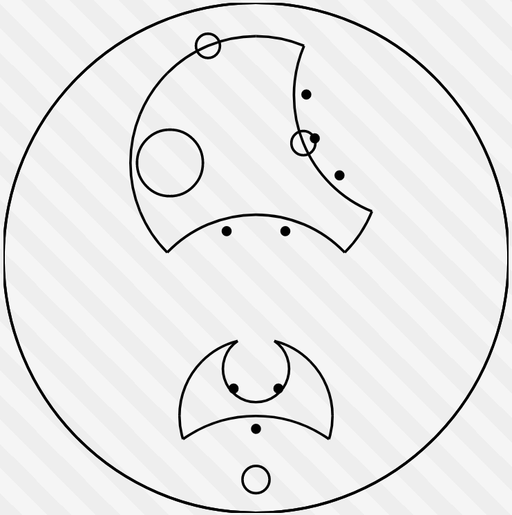
Dots are now centre-aligned and evenly spaced across the curve of a letter for s and d blocks:

I'm not happy with the dot placement. For the d block, it looks fine until there's a vowel overlapping. For the s block, it looks like shit, and when there's a lot of stuff going on in the image they even overlap with their letters. The dots are currently <circle>s instead of paths, so they're constant size - that needs to change.

  • Draw dots using path, not circle
  • Split drawDots between addDots and drawPath
  • Fill dots
  • Draw dots at a size that is relative to something - probably radius of the word? Not sure what exactly

I want the dots to be a distance away from their letter that is constant across the whole word, so that calculation can't be a simple fraction of the letter's radius as it is currently. I also want to keep that same distance even when the dot size varies, so they can't be placed directly onto that line - they need to be placed such that they're tangential.

@rossjrw rossjrw mentioned this pull request Oct 22, 2021
Sign up for free to join this conversation on GitHub. Already have an account? Sign in to comment
Labels
essential This is required for the minimum viable product feature Add a new feature
Projects
None yet
Development

Successfully merging this pull request may close these issues.

Dots
1 participant